Episode 23 – Graphing Is Great
First, you will need to download the Graphing is Great lab manual.
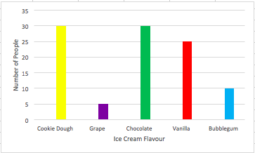
If we were to survey or ask 100 people for information about their favourite ice cream flavour, how could we best see the results without having to read 100 responses? That sounds exhausting. The answer, making a graph. A graph is a visual way to represent data.
There are many types of graph, but all graphs will contain an x-axis and y-axis. The x-axis is along the bottom of the graph and includes information about what we are trying to measure. In our ice cream example, this would be the types of ice cream! The y-axis is horizontal, on the side of the graph. It includes the responses or your findings. This would be the number of people for our ice cream example!
Our graph may look something like this for our ice cream example:

This activity will encourage you to complete a series of tasks and collect some data. Then, a graph will be created to represent that data!
Did you know graphs were first introduced in the 18th century? Yes! A Swiss mathematician named Leonhard Euler was trying to solve a problem related to bridges, asking if it was possible to cross every bridge in the city of Kaliningrad, Russia only once. Euler used data to determine if this was possible. Perhaps you can take up and solve a similar problem in your city!
Saskatchewan Curriculum Connection: SP3.1: Demonstrate understanding of first-hand data using tally marks, charts, lists, bar graphs, and line plots (abstract pictographs), through collecting, organizing, and representing.
